Select a category
Empathy In Your (inter)Face
In The Media Equation Reeves & Nass find that people interact and respond emotionally to computers pretty much the same way we interact and respond to other humans.

In The Media Equation Reeves & Nass find that people interact and respond emotionally to computers pretty much the same way we interact and respond to other humans. Stephen P. Anderson illustrates pretty much the same thing in his book Seductive Interaction Design:
We identify with (or avoid) certain personalities
Trust is related to personality
Perception & expectations are linked with personality
Consumers choose products that are an extension of themselves
We treat sufficiently advanced technology as though it were human
If the interface is cold, heartless, and unforgiving, we respond to it emotionally the same way we would if we were interacting with a cold, heartless, unforgiving person.
Here are some examples of some notifications that something went wrong. Which do you prefer?

While perhaps technically accurate and helpful to a programmer, the first error is pretty much useless to the regular user, who is left to wonder in dismay at what just happened and what it means to the action they were performing.

This explains in very human-readable terms what probably just happened, what the error code is (for those who might care), and some possible solutions (retype the URL, send them an email).
Here’s another way to look at it
You’re shopping for a spice called Garam Masala. You know what it is (if you don’t, try some!), but many don’t. You walk into the store and ask to be directed to the spices. You spend a few minutes searching but just aren’t able to find any garam masala — so you ask an employee for some assistance.
You: “Pardon me — do you know if you carry garam masala, and if so, where I could find it?”
Employee: “No.”
You: “No? No you don’t carry it or No you don’t know where it is.”
Employee: “Yeah.”
You: “Ummmm…okay.”
vs.
You: “Pardon me — do you know if you carry garam masala, and if so, where I could find it?”
Employee: “Hmmm…I’ve never heard of it. How’s it spelled? Let’s see if we can find it.”
…employee helps you look…
Employee: “I’m sorry — if we do carry it, it doesn’t appear to be in stock. I’ll ask my supervisor about it. Is there a way I can reach you to let you know what I find out? Meanwhile, you might try <Super Spice Store> — they tend to carry a really large variety of spices and you’ll probably find it there.”
You: “Sure — thanks!”
Which scenario would make you feel more at ease? In which scenario are you more likely to return to that store again even though they weren’t able to help you out this time? Which scenario is more like interacting with a heartless, non-empathetic machine?
One example of this that has always bothered me is the PoS system (aptly named) at the grocery store. You slide your card and type in your PIN. When the cashier has finished ringing everything up (if, in fact, you didn’t slide it too early and have to do the whole process all over again) you’re presented with something akin to this:
Total: $123.35
Is this amount okay?
[ YES ] [ NO ]
And every time I want to hit the [ NO ] button. What if I feel that this amount is too costly? What if I really only want to spend $95 instead of $123? Heck, what if I want to pay more? Most of the time, if I’m honest with myself, and the machine, I must hit the [ NO ] button. I can’t though, because I know that’ll probably void the transaction, which is why I’m here in the first place. So, I’m forced to answer ‘yes’ to a question that I adamantly believe should be answered ‘no.’ The machine made me lie, and now I’m not only unhappy about the cost, I’m unhappy about the experience.
What if you at least corrected the English in the question, and instead you were presented with this:
Total: $123.35
Is this the correct amount?
[ YES ] [ NO ]
This is actually what the system is asking for. Now I’m not being asked to lie — but now the computer, whose job it is to add things up since the abacus, is asking ME to do its job for it — add up all the values, calculate sales tax, etc. This doesn’t breed confidence in the system. I could guess, by we pretty much trust the machines to know these things. So now I’m not sure — did everything get rung up correctly? Did my sale items register at sales prices? I don’t know if it’s really correct. Is there an “I don’t know” button? Nope. This message still lacks and I’m forced into answering something I’m not comfortable with.
I LOVE the convenience technology affords us, but it’s not justification to substitute an impersonal experience for a cold, heartless one. We can have convenient tech and warm-n-fuzzy mom-and-pop-shop-style interactions too!
Cause I’ve got an idea!
What if it went down like this…
You’ve swiped your debit card. The system knows who you are now (your customer rewards card is linked to your debit card) and pulls up your recent purchase history etc.
Hey Brandon! Your total today is:
$123.35
Is this amount okay?
[ Sure ] [ Not Really ]
You’re not really feeling the total today, so you click [ Not Really ]
I’m sorry about that. How about this total?
Total: $115.00
Is this amount okay?
[ Sure ] [ Not Really ]
Hey — that’s cool. It just gave you an $8.35 discount! Maybe it’s still too high, and heck, it won’t hurt to try again…you click [ Not Really ].
Dang — I’m really sorry. That’s the best I can do today Brandon.
Total: $115.00
Would you like to continue with your purchase, or come back another time?
[ Continue ] [ Come Back Later ]
Now you’re feeling like you were able to get a deal and have a positive interaction with the (more humane) system. You click [ Continue ].
Thanks for your purchase, Brandon. I’m printing out some relevant coupons that might help you save a bit more next time.
Heck, even if you clicked [ Not Really ] and it straight up said the first time “sorry dude, no deals this time” you’d feel like you’d at least tried and the machine empathized with your lack of desire to part with your money.
You see, as in life, even when the answer is NO, when executed well and empathetically, you can foster good-will and trust with your customer/user which will encourage repeat business. It’s not hard — just inject some personality into those dialog boxes and copy. Breathe some life into those warnings, errors, and success messages. After all, it’s not really the computer we’re interacting with, but the designers and programmers that brought the system into the world.
So all you supermarkets and convenience stores out there with your fancy PoS machines and rewards cards — build me something cool and empathetic that might potentially throw me a bone now and again with some relevant coupons or an immediate savings of a few bucks just to let me know you value me as a customer and understand what my needs and desires are. That would make me RAVE about you to my friends and family and return again and again in the hopes that maybe this time I’ll get the response:
“Hey Brandon, you’ve been a loyal customer over the past few months, so today, your milk is on the house. Have a great day!”
My Unlimited Signature
From the day we are born, people are trying to limit us. They don’t usually do it out of malice or in an attempt to hurt us; on the contrary — often they do it because they love us and want to help and protect us. These limits come in various forms.

Two Weirdos Getting Married Oct. 31st, 1998
This will make sense in just a second…
Things I designed/made in this picture:
Her wedding dress
His suit and shirt
The cake
The cake stand
And this is my email signature:
A human being should be able to change a diaper, plan an invasion, butcher a hog, conn a ship, design a building, write a sonnet, balance accounts, build a wall, set a bone, comfort the dying, take orders, give orders, cooperate, act alone, solve equations, analyze a new problem, pitch manure, program a computer, cook a tasty meal, fight efficiently, die gallantly. Specialization is for insects.
- Lazarus Long (Robert A. Heinlein)
And this is why…
From the day we are born, people are trying to limit us. They don’t usually do it out of malice or in an attempt to hurt us; on the contrary — often they do it because they love us and want to help and protect us. These limits come in various forms:
1. What do you want to be when you grow up?
You have to grow up
You have to narrow your vision to one very specific thing and do it quickly or something bad will happen.
2. The sky’s the limit!
There’s a limit
Don’t try to go beyond the sky, that’s too far
3. Stay inside the lines.
Deviance from the norm is unacceptable
Beauty is pre-defined and not discoverable
4. Why can’t you be more like <insert name here>?
Here’s a box, fit in it
Different is bad
And there are many others like You have to have money to make money. You only live once. Pick something reasonable. Be realistic. That’s just a pipe dream etc. There are a million ways the people who love us want to protect us, so they tell us the things they think will help us hurt less, fail less often. However well-meaning they may be, they’re limiting us to one degree or another.
The Wayback Machine
When I was a teenager, and early in my career, I considered myself a Jack of All Trades. I could build a house, fix an engine, sing professionally, paint a car, repair a bicycle, build a computer, design a wedding dress. I was pretty darn proud at how diverse I was. I saw this as an asset and I continued to seek additional skills. Then one day I heard the rest of that expression:
Jack of All Trades, Master of None.
Oh crap, I thought, if I can do all of these things, I must not be very good at any of them! Who wants to hire a mechanic who can sing? Who wants a computer geek who designs clothes? I’d better stop generalizing and really start focusing! I changed my résumé to reflect just one skill. I picked a title for myself. I didn’t mention all the other stuff I could do or enjoyed doing during interviews — I thought it might distract and draw focus from what I was really good at.
This philosophy seemed to work…for a little while. Then one day I found myself applying for a job as a writer. As I finished up the writing portion of the interview, the HR person came in and said “It says here you know Flash and Photoshop as well.” to which I replied “Sure.” “Well,” she said, “we have another position here that pays more and I think you’d be perfect for it. It requires someone who can code AND design, and those are very hard to come by.” So I applied for, interviewed for, and got that job instead. And my next job. And the job after that. And the next 2 jobs after that. And…
Be All The Things
Pretty soon I came to realize, being able to call yourself a master at something is cool, but having great skill and mastering LOTS of things makes you invaluable, employable, and, dare I say it, much more interesting. Then one day I happened upon the Heinlein quote and discovered why I’d always been at odds with the Jack quote.
“Jack of All Trades, Master of None” implies limits. It assumes you cannot be a master of any/all those trades. It’s a limiting thought and it’s damaging. One day someone Tweeted something to the effect of
“How can they expect me to be a great designer AND learn to code? Won’t learning to code take my focus away from my true craft?”
To which another replied
“Why not be great at both? Haven’t you ever met a great programmer who was also a great musician?”
This hit home for me for a few reasons:
I was a Lead Developer
I have 2 degrees in music, another in Theatre, and a Masters degree in Interactive media
I was a Lead UX Designer.
Of course, you can be great at lots of things — I am. I’d bet most people are. You’re probably awesome at lots of stuff. But, for some reason, our culture wants to silo you off, box you in, label, and pigeon-hole you. Applying these limits makes things easier on them and doesn’t help you at all. Why limit yourself, and you sure as heck shouldn’t allow others to limit you. That’s the over-protective masses talking in the back of your head telling you to stop dreaming so big because you’ll fail and feel bad. To firey places with them. I want to be Lazarus Long. That’s why that quote is my email signature. I refuse to limit myself to the confines and fears of others. I’ll be what I want to be and do what I want to do — because it makes me better at everything I do.
I’ll be what I want to be and do what I want to do — because it makes me better at everything I do.
I’m a better designer because I code and a better coder because I design. I’m a better father because I design and a better husband because I’m a father. It goes on and on.
Specialization is for insects.
PS — here’s how I’m doing with that list. What about you?
change a diaper ✓
plan an invasion
butcher a hog
conn a ship
design a building ✓
write a sonnet ✓
balance accounts ✓
build a wall ✓
set a bone ✓
comfort the dying ✓
take orders ✓
give orders ✓
cooperate ✓
act alone ✓
solve equations ✓
analyze a new problem ✓
pitch manure ✓
program a computer ✓
cook a tasty meal ✓
fight efficiently ✓
die gallantly
A Credo
I believe in…
I believe in truth.
I believe in absolutes.
I believe in work.
I believe in reward.
I believe in leisure.
I believe in family.
I believe everyone can teach.
I believe everyone must learn.
I believe I am very often right.
I believe I am very often wrong.
I believe in changing my mind.
I believe contention breeds ignorance and disgrace.
I believe in disagreements.
I believe in fighting.
I believe in forgiveness.
I believe in winning.
I believe losing sucks.
I believe in ownership and responsibility.
I believe in power.
I believe in credit.
I believe in honor.
I believe in integrity.
I believe in unity.
I believe in teams.
I believe in speaking.
I believe in listening.
I believe in self.
I believe in ego.
I believe in humility.
I believe in love.
I believe in service.
I believe in science.
I believe in ideas.
I believe I can.
I believe I sometimes won’t.
I believe I am strong.
I believe I am weak.
I believe in beauty.
And because I believe,
I do.
The Service Design of Nest
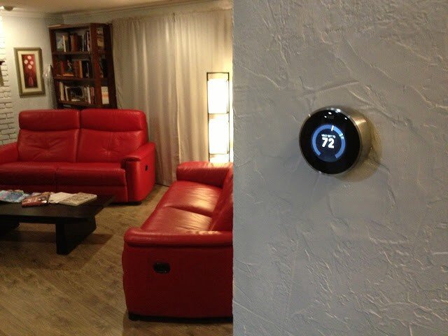
There are many reasons to get a Nest thermostat. It’ll probably even pay for itself in a year or two, then start saving you money after that. Here’s the clincher though — the reason I evangelize the Nest wherever I go.


Yup. All kinds of old-school fugly.
Here is what I had immediately following the install of my Nest:


Here it is once I fixed the texture and painted:
Here were the features of my old thermostat:
Adjust-ish temperature of house from device
And that’s it.
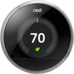
Here are some of the features of the Nest thermostat:
Adjust temperature of house from device precisely
Adjust temperature of house from anywhere in the world
Program device to adjust temperature of house
Teach device to adjust temperature itself automatically
Detect when I’m home/away and adjust temperature accordingly
Just use the fans and turn off the heat/cool to conserve energy when possible
So those are just SOME of the features of the device itself. That feature-set is enough to convince many it’s a good buy. But there are a lot of thermostats out there that do that sort of thing (sort of). Why should you buy this one?
So, sure. It’s really cool looking. It’s got that nostalgic feel where you just rotate the outer ring to raise/lower the temperature. It’s got a nifty LCD screen with animated features that tell you all sorts of things. You can control it from your mobile device with a free app.
“Brandon!” you say. “What the heck is the point of this post already?”
OK — here it is.
These are all great reasons to buy and install the Nest thermostat. It’ll probably even pay for itself in a year or two, then start saving you money after that. Here’s the clincher though — the reason I evangelize the Nest wherever I go: It’s all of this, and more. The most important two words of this whole post: and more.
When you hear about the Nest for the first time it’s kind of silly — why is everyone getting psyched about a thermostat? Guess I’ll check it out. What’s the URL? nest.com — oh cool, that’s easy.
1 point Nest.
…and more…
Okay — I’m at nest.com, wow — gorgeous website; clean, simple, rich with details and animations.
10 more points Nest.
…and more…
Really helpful information, tutorials, testimonials etc.
5 more points Nest.
…and more…
But how do I know if it’ll work with my old and busted system? Oh — an online compatibility checker — sweet!
15 more points Nest.
…and more…
And that’s when I pre-ordered my Nest.
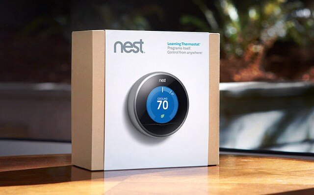
When you get the box in the mail — it’s beautifully packaged.
Here is a very detailed video I suggest watching that covers pretty much the whole 9 yards.
…and more…
As you unbox the Nest, even the attention paid to how and where the items are placed is impressive.
10 more points Nest.
…and more…
Just about every tool you might need is included.
5 more points Nest.
…and more…
The instruction manual is very clear, easy to understand and full of pictures.
5 more points Nest.
…and more…
The manual contains little stickers I can use to label my cables as I disassemble my old piece of junk so I can hook it up to the Nest correctly.
5 more points Nest.
Here is what mine looked like at this stage in the process:
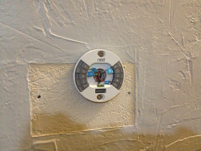
Note: It also comes with a cover plate that would’ve covered up that nasty wall without having to texture and paint, but I was going to do it anyway.
At this point, I’m just giddy with anticipation. All I have to do now is plug in the main device and we’re good to go. Oh, crap:
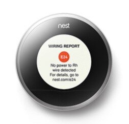
Crap crap crap. The first thing I see is an error. That’s not good.
-20 points Nest.
…and more…
What’s it say — There’s an error code — E24 and there’s a URL — nest.com/e24, so I go there. Oh, I probably just have a loose wire. I pull off the device, sure enough, exactly what they stated is what has happened. I reseat the wire and plug the device in — it works perfectly. The error was actually my fault, but the error reporting and ease of resolution have now made me a Nest fanboi. I’m actually GLAD I got the error so I could see how well they handled it.
+50 points Nest!
…and more…
It gets better. Now I install the iPhone app. I can’t even begin to tell you how cool it is. The stacked bar charts, the gamification of keeping my home green and warm all while saving money…it just goes on and on.
+100 points Nest.
…and more…
And now that everything’s installed, I hand the iPhone to my wife. She starts to play with it and falls in love with it after about 5 minutes. Her first experience with Nest was the iPhone app — and she’s just as big a fangirl now as I am. As I am a fanboi that is. Ahem…
+1000 points Nest.
Total: 1186 points Nest
Every day I discover new features on the hardware and the mobile app that continue to engage and satisfy.
This is Service Design
This is what service design looks like. It’s the magic recipe for success in your startup, design, party, endeavor — it doesn’t matter: always be ready with the ‘and more’ for your customer. When you can anticipate and pre-fulfill their needs at virtually every single step of the way like Nest has, you win. Each time a user interacts with your brand or product — that’s a touchpoint. Good service design ensures the user experiences ‘surprise and delight’ at each touchpoint, even if it’s an error or a support call.
At every step of the process from learning the nest.com URL until I handed the phone over to my wife, Nest surprised and delighted me. And more. Every single time I moved from one step to the next, I felt that Nest always had my back and had solved my problems before I even knew I had them. Imagine if every service, device, and software application we used went to such great pains — I think the world would be a much happier place, and more.
DISCLAIMER: I do not now, nor have I ever worked for Nest.
But they can reach me here!
Flight of the Buffalo
If you’re the leader and your minions aren’t performing up to snuff, or business isn’t going the way you want/expect — you need to introspect your query into the cause because it’s probably you.

Appa — the flying bison. This is an awesome still from one of the worst movies of all time. Unfortunate, because it’s one of the best animated series of all time.
There is a fantastic book called The Flight of The Buffalo. It’s one of those “managing people” books, and the title is actually very apt once you learn the metaphor. Buy it and read it. You’ll be glad you did.
Anyway…One of the major premises of the book that I loved was this: When something isn’t going the way you want, always begin your inquiry into the problem with:
“What is it that I am doing wrong?”
The idea is this: If you’re the leader and your minions aren’t performing up to snuff, or business isn’t going the way you want/expect — you need to introspect your query into the cause because it’s probably you. If Johnson didn’t land that account that was in the bag, it’s probably because either a) YOU didn’t train/inspire/counsel/trust, etc. her/him well enough or b) YOU shouldn’t have hired her/him in the first place. Nearly every problem a leader sees in their team is due to a lack or failure in themselves. Good leaders know this. Great leaders do something about it.
So what has this got to do with design?

“Who me!?” — Han Solo
Most, if not all, of us, have sat across the table/monitor while we’ve watched users click the wrong link, choose the wrong option, go down the wrong path, stare blindly at the screen, lost, confused, bored, angry or apathetic. I myself have felt the desire to perform a remote Jedi choke when the user I was watching said something so obtuse and moronic I could’ve died. Then, when my pride had stopped choking me, I was able to sit back and ask myself “What is it that I am doing wrong?” And that’s the key. As UX/UI designers we are Tron — we “…fight for the users.” Notice the ‘for’ — it’s really important. We aren’t CLU or the MCP who fight against the user. So when the user isn’t successful, it is often us that have failed them and we need to ask ourselves what we’re doing wrong.
Introspection Brings Insight
I find that this kind of introspection to be incredibly insightful. It sheds light on end-user issues, biases, misinterpretations, misunderstandings, incorrect assumptions, process holes, bad data, poor design, bad choices, bad marketing, poor user experience, bad business practices, flawed methodologies, skewed perceptions, prejudices, pride, stupidity, apathy, and simple mistakes. <breathes> But what I find most amazing about approaching an issue from this tack is this: When I am the problem, I am also the solution. I can change me. I can change my processes. I can improve this or that. I can modify this, that, or the other thing. When you can follow the problem all the way back to yourself you’re equipped and able to begin setting things in motion to affect (and effect!) change for the greater good — and not just in your designs, but in your entire organization.
So the next time something goes awry with that thing/person that upsets you all the time, take some time and ask yourself: “What is it that I am doing wrong?” and you may find some new epiphanies that lead you down a more enlightened path — where buffaloes take wing.
Seriously, read the book. Then you’ll totally get it.
Hey UI: Say what you mean, and mean what you Said
When Redbox first rushed their streaming service to market, they made a few missteps. My initial foray into using the service met with a few stumbles. I documented what I discovered, and a simple way the issues may have been avoided.

Anything to satisfy my wanton desire for massive amounts of media…
Around March of last year, I played around with Redbox Instant. There was a lot I thought they did well — namely, make it enough like Netflix that it’s easy for lots of people to start exploring, but different enough to be, well, different.
One of the things Redbox has going for it as a key differentiator is the they have kiosks everywhere. In fact, one of my favorite locations (at the time) in Coeur d’Alene, ID had 2 kiosks, and I could see a third one across the street.
So I’m a fan. That said, as with all things, there are some things I wish could be just a little more this or a little less that. Or just changed. Case-in-point:

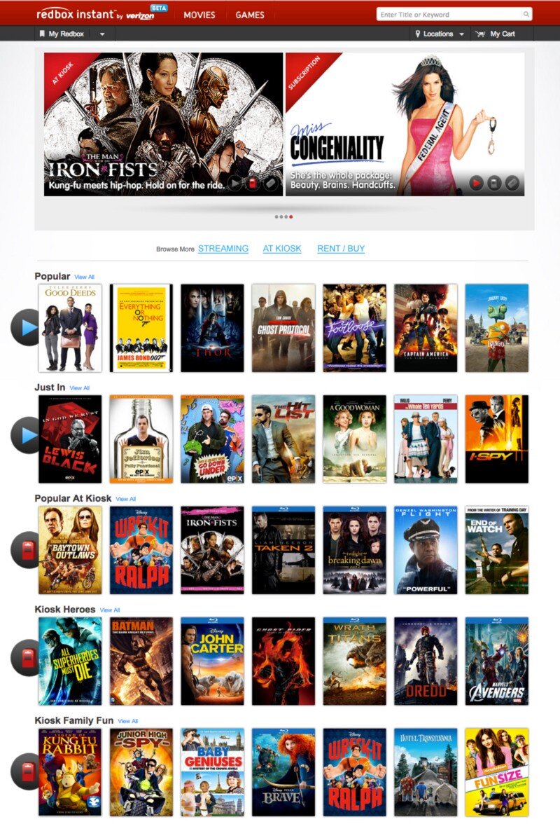
circa March, 2013
This is the screen I was greeted with when I visited redboxinstant.com (ca. March, 2013, now just redbox.com). With a quick scan, I saw there were some menu items, some featured movies, 3 grey buttons I’m not going to bother reading just yet, and then movies I can browse (not sure if that’s instant or kiosk or both yet). Then I saw there’s a search bar at the upper-right.
I scanned the carousel then below it to check out those 3 buttons since they looked important:
Subscription, At Kiosk, Rent / Buy.
Ok — so I can change my subscription features. Did I order a magazine? No, that’s probably the subscription to Redbox Instant. I can view what’s in the kiosks or I can rent and/or buy. Cool. But where do I see the streaming, instant movies?
I started scanning again — top-left corner:
“Redbox Instant” … hmm, okay. I didn’t accidentally go to redbox.com which is a totally different site altogether. This IS where the instant movies are. So that must be them there in the first row of browsable movies there. It must be the default.

I moused over Thor.
Yep. Big red ‘WATCH NOW’ button. These all seamed to be instant. Great. They got the defaults right. Thing is — why did I have to check? Why didn’t I just KNOW?
So I scrolled down to see what else they had.

Oh snap! They had Wreck-It Ralph, The Man With the Iron Fists, Taken 2, Flight and Dredd — all on instant! These had just dropped on DVD/Blu-Ray and were months from being released on Netflix. I thought
Props to Redbox — If they can keep up w/ releasing their streaming at the same time as their Kiosks Netflix has some serious catch-up to do! I’m gonna watch Taken 2.

So I hovered over Taken 2…
Wait — Blu-Ray? Must be a screenshot, I thought. Perhaps it means it’s a higher-quality stream ala Vudu’s HDX…
Hey — where did the Watch Now button go? I hovered over the rest — it was gone from all of them. Then I noticed the header, just above The Baytown Outlaws. Oooooh, Popular at Kiosk. Okay, so now I could see all of these were at the kiosk. Got it.
So initially, when I got to redboxinstant.com, I thought I was viewing streaming movies by default — otherwise, I’d have gone to redbox.com. So then I saw they’d started to merge their content — okay, I guess, eventually I suppose it’d all be merged at redbox.com. Fine. But right then, I wanted to watch an instant movie, got excited to see all the instant movies available, and ended up disappointed.
So in about 10 seconds, here’s the gamut of emotions I felt when I hit the home page:
Satisfaction (happy to have this service!)
Confusion (not sure what I’m looking at)
Understanding (I’m looking at instant movies)
Excitement (I’m gonna watch Taken 2 right now!)
Confusion (why can’t I watch it right now?)
Disappointment (oh — I’m viewing kiosk movies too)
Indifference (ah — I see they have trouble getting great streaming content quickly, just like Netflix)
Back to those 3 buttons…maybe there was something I missed. My stream of thoughts went something like this:
To their left I took the time to actually read the text I’d purposefully skipped earlier: “Browse More”. Browse More — Subscription. What the heck does that mean? I haven’t subscribed to anything, no magazines, no RSS feeds, no services…oh, redbox instant could be considered a service, is that what they mean by Subscription? If so, why isn’t it selected to show that I am, in fact, viewing instant, er, I mean subscription movies? I guess I’m viewing both, maybe? There is nothing to indicate what the list of movies I’m seeing is or where they can be found. I have to guess and check. My guessing and checking leads to understanding, excitement and ultimately confusion, disappointment and indifference. Now I have to click those 3 buttons to see exactly what they do. Oh — they take you to a set of pages that functions how I thought THIS page would function in the bloody first place.
Some very simple things can be done in about 15 minutes to save me, and thousands like me the 10 seconds of mental effort it took to get through all that and then generate a blog post:
Subscription? Really? Say Instant. Say Streaming. Say Online. Lots of other words to use. Subscription is just…wrong and means something else.
Indicate what the rows of movies below are.
Change the 3 buttons to something more indicative of page navigation links.
When you click on those buttons you actually navigate to another page entirely. The current style doesn’t make that very clear. So don’t make them look like a broken toggle/selected skin for an AJAX refresh, give me some other indicator that I’m viewing movies available for streaming AND at the kiosk.
Here are some simple ways we could address these issues:
I used the ‘Instant’ and ‘Kiosk’ icons already in use above in the featured movies (I didn’t even notice those until I started looking for how Redbox might have already differentiated instant from the kiosk). So they’ve already made the icons — just label each row what it’s full of and you’re good! This doesn’t affect the page size or layout at all and I think things are a lot clearer.
But even if you don’t do numbers 2 and 3, please Redbox, please, change the ‘Subscription’ to something that makes sense.
Arrr, Know Yer Personæ
If I were designing software for pirate captains who fight prehistoric sharks, my software would suck. Why? I don’t know enough about how they function and what options they have available to know what item(s) are most important to them in time of potential crisis.

Today the conversation at lunch inspired me to start writing a movie about a Megalodon that travels through time — that’s right, a time-traveling, prehistoric shark. Deal with it. Anyway, in the prologue, there’s a scene with a pirate captain. Oh yeah — it’s got pirates too. Sharks as big as Blue Whales: check. Time Travel: check. Pirates: check. I’m telling you — MEGA blockbuster. So, anyway, this pirate captain is carousing with his, um, cabin-mates, and he senses something is wrong. He grabs his [I have no idea what to put here] and heads up to the deck.

I have quite a bit of life experience. I’ve seen a LOT of movies. I’ve seen quite a few pirate movies. And, for the life of me, I have no idea what the pirate captain grabs when heading to the deck to see what’s wrong with his ship. Does he grab his sword? Does he grab his eyeglass? Does he grab his pants? A coat? I have no clue.
If I were designing software for pirate captains who fight prehistoric sharks, my software would suck. Why? I don’t know enough about how they function and what options they have available to know what item(s) are most important to them in time of potential crisis. I haven’t developed that persona enough to adequately comprehend and empathize with them in order to affect a design capable of responding to or, better yet, anticipating their needs.
If I’m designing a widget for a camping trip — and I make it so that widget requires constant access to wi-fi or cellular data I’ve probably failed. I’ve failed because I’ve not understood the personæ enough to know that they may not (and most likely will not) have access to wi-fi or even a cell signal whilst out and about.
If I’m designing an app for a nurse and it requires to be held with one hand and accessed with the other hand’s index finger, I may have failed. What if the nurse has to be doing task X with his left hand while using the app? Now all he has is his thumb — but I didn’t design it to be used with the thumb, so it’s awkward and slow and causes him to lose focus on his other duty — now Mr. Johnson’s catheter has to be reinserted, and we all know what a curmudgeon Mr. Johnson can be…
Knowing your persona can be a life-saver. I’m not saying you have to know how many kids Cindy has and their ages and favorite Power Puff Girls when designing the icon for the shopping cart button, but knowing that Cindy always has her Fred Meyer rewards card on her could be the difference between frustrating and delighting her. All I’m saying is — know your users/customers/clients what-have-you. Know them better than they know themselves, and you’ll know how to better serve them through your craft.
Now, time to get in the head of a pirate captain…what would he grab…maybe his spare leg? Rum? Lucky amulet? Time to do some ‘user’ research…(suggestions welcome).

The Billion Dollar Idea
I had a billion-dollar idea at lunch today: Mouse-over to buy. © ™ Patent-pending. Think about it — no more clicking needed!
I had a billion-dollar idea at lunch today: Mouse-over to buy. © ™ Patent-pending. Think about it — no more clicking needed!
Use-case:
Sarah visits Zappos.com (she’s already logged in from her last session — cookies FTW).
Sarah sees some shoes she likes and hovers over them to see the enlarged image.
BAM! Sarah just bought some shoes! Conversion without clicking! © ™
Sarah sees a featured dress off to the right…
BAM! Another sale before she’s even clicked the picture!
…2 days later…
Sarah gets an entire UPS truck dumped at her door and a bill for $55,324.69. (shipping was gratis, of course, Sarah moused over Amazon Prime at some point).
Zappos.com sees a spike of sales the first week dwarfing everything they’ve ever sold ever and goes down in the Guinness Book of World Records for the largest online sales numbers in history.
For some reason, this generates a TON of free press as well.
The end.
Really — that’s the end. No need to think about anything else after that.
The UX / UI Design Process
This is a basic rundown of the high-level concepts behind doing user experience research and design. State of the art for 2014, but largely still relevant today.
At its core UX is not a deliverable, but a business strategy and competitive advantage in the marketplace. — Troy Parke
Most of what I do isn’t actually making stuff. I’d say a large portion of my day is spent scratching my head, thinking, trying to match up users’ needs with viable interaction. I also attend a lot of meetings. And I talk to people. All the people; users, stakeholders, CEOs, developers, users, product owners, QA, doormen, literally…all the people. But, eventually, the people paying the bills want to see some deliverables. This post is a not-so-brief understatement of what UX designers generally do and some jargon in which we tend to do it.
For me, the core elements for the process are:
Stakeholder Interviews
User Interviews
Stories
Personæ
Scenarios
Mind Maps
Process Flows
Sketches
Interactive Wireframes/Prototypes
Style Tiles, Style Guide
Hi-Fidelity Comps
Stakeholder Interviews
This is where it all starts. The C-suite, product owners, architects, lead developers — anyone and everyone who has a stake in the success and desired outcomes of the project. What does the business expect to get out of this product? What are their goals, KPIs, rubrics? What does success look like to the CEO vs the CTO vs the Director of Training and Support? Understanding the undercurrents of the people that sign the checks and check the boxes is critical to the success of any UX effort.
As UX designers, we’re crucially and critically placed in a position to hold a lot of sway with the leads of every organization across the board. If we can build bridges and channels of communication between the disparate teams, we can empower our clients and ourselves to do truly meaningful, productive, and successful work.
User Interviews
When possible, getting feedback from actual users who actually use the current product (if there is one) or might potentially use the one we’re creating can be invaluable, hence user interviews. If you intend to build something, best get some input from the people you’re building it for. The actual users have more insight and clearer understandings of the problems they have than anyone else, including the designer. Getting their input can help us avoid going down paths that ultimately go nowhere and open up doors that we couldn’t see ourselves. That said, it’s important to weigh each user response carefully. As the (apocryphal) saying goes — if Henry Ford had asked people what they wanted, they would have asked for ‘faster horses.’ Sometimes the user doesn’t know what they really want or need, but they know their problems and issues, and even though they might not know the answer (which is the designer’s job anyway) they can help you find the right path that leads to it. Additionally, by observing them in their realm first-hand we can gain insights impossible to ascertain any other way.
Stories
When I take on a new project, it’s incredibly important to understand the stories behind it. Namely — what problems are we hoping to solve, what things are we trying to improve, who are we trying to help etc. These questions help set the stage for all of the work that follows. If the UX or UI don’t support the initial stories we defined at the outset, then we need to regroup and come up with ideas that do. The stories serve as an anchor to keep us grounded and focused on the overarching reasons we’re building the project in the first place.
Personæ
In order to effectively create a meaningful and useful solution we first need to understand and try to design what the end-user needs. One of the most effective ways to divine the user’s needs is to generate detailed and meaningful personæ. Where the stories help us focus on the problems and endgames, the personæ help us focus on the people who will actually use the product, without which the entire process is pointless and an exercise in futility. If stories are the anchors, the personæ are the rails along which we guide each decision, ensuring that the experience and interface are always focused on the user and helping them accomplish their goals with minimal cognitive friction.
Scenarios
Once we know what we’re building and for whom, we can create use-case scenarios that help us identify in more detail individual steps in the processes we’ll need to account for. The scenarios are the rough sketches that begin to define the workflows and experiences we hope to create for the user.
It’s really important to note here that the scenarios capture what the user is doing, but not how. Not yet anyway. Otherwise, you’ve stacked design effort onto yourself before you even understand the varied tasks people will need to perform.
Mind Maps
I love mind maps. Mind maps are my friend. They help me start to wrangle all the scattered thoughts and possibilities into a more cohesive pattern. Creating the mind map is the first step toward defining concrete design patterns, components, and detailed use-case scenarios. They’re easy to make, easy to update, easy to read, and incredibly effective at surfacing missing and redundant items and flows.
There are a ton of mind-mapping software solutions today. I like MindMeister and Miro at the moment.
Process Flows
With everything shaping up now, we can outline some process flows. Using UML-style diagraming we can map out how the user will proceed through the different steps and stages and reach their goal. The process flow can be one of the first real deliverables to stakeholders and other teammates. At this point, everyone has a chance to begin to catch the vision of how we’re attempting to solve the problem through improved usability and process. The flows help indicate how the user will progress and serve as a guide when creating the actual artwork.
Sketches
While almost never a client deliverable, sketching helps me begin to take the ethereal vision of the project and give it a corporeal shape. Until now, we’ve been primarily concerned with high-level “Whys?” and “What ifs?” Now we start to pave the road that leads to the actual software.
Interactive Wireframes
Now that we know what we want the user to do and when we can sketch some wireframes to begin architecting the visual interface. The wireframes will serve as the skeleton of the interface. They are easy to make and update and can even be used in additional user surveys in a process called ‘paper prototyping’. Wireframes can also serve as a scaffold to help the engineering team begin to formulate plans and designs of their own. This can be another checkpoint where stakeholders can review progress and see the product begin to take form and function and come to life.
What makes a wireframe interactive? Simple: by wiring up a wireframe (or even bits of paper) so I can advance down a path in a way emulating how the actual software might work — it’s now interactive. It can be as simple as shuffling pieces of paper, adding hotspots to images in Keynote, or using powerful tools such as InVision (2020 EDIT: I now use Figma almost exclusively). Better yet — I love to wireframe in the browser using frameworks like Foundation and Bootstrap. That way you’re that much closer to reality. Regardless, the sooner you can introduce interaction into your designs, the better. Period.
Building the prototype forces you through the actual steps of building something that works (at least to some degree) as the intended final product. Building a prototype will shed light on problems and nuances in the product that were impossible to foresee otherwise. It can also validate decisions made, or showcase in painful glory any mistakes. Fortunately, it’s still not too late and early enough in the game that you can regroup and iterate over any lessons learned in the prototype phase.
Style Tiles / Style Guide
Style Tiles are useful little tools that help you start to play with the final look and feel of an application without spending hours mocking things up over and over again. Designers love them because of how rapidly they can be produced. Clients love them because it gives them an easy way to quickly grok different stylistic visions for a project.
Once the vision is decided upon, creating a style guide can be incredibly useful to ensure that exactly what you designed gets implemented. It also lays the foundation for additional work in the future. Having a living style guide can help ensure predictability and consistency throughout a product as it grows. It also provides the perfect reference for the engineer so there’s never any question as to exactly how they should implement the design.
Another incredibly useful way to work here is leveraging Brad Frost’s Atomic Design principles, style guide resources, and dynamic site generators like PatternLab.io. Anything that gets you finished product faster that’s more maintainable, buildable, and extensible is a huge win IMHO.
Hi-Fi Comps
Once you’ve iterated through the process, wireframes, and styles you should have enough information that engineers can begin building the foundations and supporting controls and interfaces. If needed, you can get to the pixel-pushing — the creation of high-fidelity comps. The hi-fi comps are the actual look/feel that will be visible in the final product. Although possibly the least important in terms of user experience, the UI is the most visible aspect of the entire product and the #1 factor in garnering trust in your users. Regardless of how awesome the workflows and usability are, if the end-product is ugly, few will want, use or buy it. This is the eye candy and where we can put the real polish and shine on all the hard work we’ve done so far.
Hi-Fi Comps are also the most expensive part of the process and should be minimized (or eliminated) if at all possible. In a world where your software or website can be viewed on any one of thousands of devices and screens, it’s literally impossible to cover every single possibility. This is why style tiles and guides are so important. By wireframing in the browser using responsive frameworks and relying on consistent styling, you’ve positioned yourself to be able to handle any device that comes your way without having to mock up thousands of views for every single page.
So — this is my process in a nutshell. I don’t always completely execute every step for every product. That’s not to say that I skip any of these steps — but sometimes they can be internalized rather than run through in full, real-world glory. I think each product requires a slightly different approach. Agile development environments and tight schedules may also limit how much time we can spend on each process — so internalizing some so we can spend more time on other, more critical steps can be vital — because in the end, shipping the product is the most important feature we will ever implement.
Did I miss something you love? Do you violently disagree? Please let me know by responding!