Select a category
Only You Can Prevent Dumpster Fires
It's our moral imperative, as people who build and design things, to not make them worse. To not add to the pile. Our job, if we actually care about doing it well, is to wring clarity, joy, and meaning out of chaos rather than stir it up.
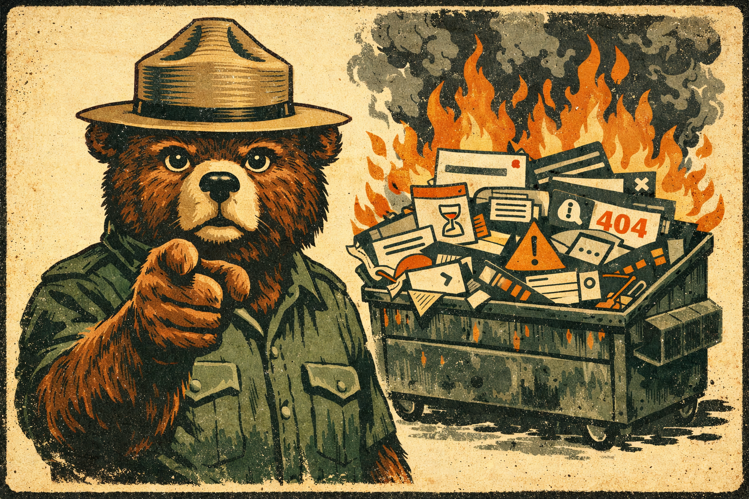
Smokey the B.A.
We all know there are piles of annoying things in the world. Many people I've encountered across my sojourn on this tiny blue dot have suggested (not without evidence) that I am one of them. Fair cop.
Even so, I'd argue it's our moral imperative, as people who build and design things, to not make them worse. To not add to the pile. Our job, if we actually care about doing it well, is to wring clarity, joy, and meaning out of chaos rather than stir it up.
So. How do we actually do this?
Design for the edges, not the average.
There is no such thing as an average user. The moment you design for some imaginary, able-bodied, native-speaking, high-bandwidth, well-lit, emotionally regulated person in the middle of the bell curve, you've already failed everyone else, which turns out to be most people, most of the time.
Accessible-first isn't a constraint. It's a forcing function for clarity. When something works for someone navigating with a keyboard, dealing with low vision, using a phone in bright sunlight with one hand, or reading in their second language, it works better for everyone. Full stop.
Accessibility isn't a feature you add at the end. It's a commitment you make at the beginning and hold throughout. If no one in your organization is owning it, congratulations: that's you now.
Have mercy on our weary eyes and brains.
The single most underrated act of design generosity is restraint. K.I.S.S. doesn’t have to be a lazy heuristic: it's a discipline. Every option you add is a decision you're forcing on someone who already has too many. Every label you leave out is a small act of cruelty. Every interface that requires a database engineer to interpret is a failure of imagination, not a failure of the user.
Build information architectures that meet people where they are, not where you are. You will always be the single least-representative person in the room for evaluating your own work. You know too much. You've been too close to it. You're likely to never be the target user for anything you will ever design, and the sooner you make peace with that, the better your work will get.
Healthcare software. TV remotes. Airline booking flows at 11 PM when you're exhausted. These things didn't get bad because no one cared. They got bad because someone stopped asking "what does this person, in this moment, actually need?"
Don't be the Earl Scheib of your industry.
Deceptive design is a choice. Dark patterns, anti-patterns, whatever you want to call them, it's a choice to treat your users as marks instead of people. And even when it's not intentional, when it's just sloppy defaults or inherited patterns nobody questioned, it's still your problem. Ignorance isn't an excuse; it's an invitation to do better.
Brand loyalty isn't built through clever manipulation. It's built through trust. It’s built through the accumulating experience of using something that behaves like it's on your side. Every confusing confirmation dialog, every pre-checked opt-in, every deliberately obscured unsubscribe link is a small withdrawal from that account. Eventually, the balance hits zero.
Protect people's privacy. Be honest about how their data is used. Own your mistakes publicly and with specificity, integrity, and humility. Then fix them.
Test your stuff. For real.
Something that seems perfect to you is probably a raging annoyance to everyone else. This isn't an insult, it's physics. You have context your users don't have. You have assumptions baked in so deep you've forgotten they're assumptions.
Do the research. Talk to actual humans. Watch them use the thing you made. Sit on your hands and don't explain it to them. The silence when they're confused? That's data. The sigh? Also data. The moment they give up? That's the most important data of all.
If you can't be bothered to empathize, test, or think critically about the people you're designing for, do everyone a favor and don't design anything. Perhaps consider a walkabout.
Give a damn.
Ultimately, reducing annoyance comes down to one thing: caring. Not performatively, not in a mission-statement way. Actually caring about the cumulative impact of your choices on a stranger's day.
If you wouldn't want to use the thing you're making, that shows. If you're more interested in what's flashy than what's useful, that shows too. The people on the other side of your interfaces aren't metrics. They're people with limited time, divided attention, and finite patience. They deserve better than thoughtlessness.
So do the right thing. Make the extra effort. Build something that feels like a small act of grace in someone's day.
You'll sleep better. And somewhere out there, a person you'll never meet will silently bless your kind, unannoying soul.
Only you can prevent dumpster fires.
The Truth About Simplicity: Why Clarity Beats the Buzzword
Designers love to worship at the altar of "simple". We chant the tired refrain: "Less is more. KISS: Keep it simple stupid. Cut the clutter." But simplicity is an illusion—a myth we've perpetuated to feel like we're making progress as we strip away features and functions, signifiers and affordances, shaving off the meat of our systems to gnaw at the bone for scraps of marrow and calling it "minimalism".
The opposite of complexity is not simplicity, it’s clarity.
Designers love to worship at the altar of "simple". We chant the tired refrain: "Less is more. KISS: Keep it simple stupid. Cut the clutter." But simplicity is an illusion—a myth we've perpetuated to feel like we're making progress as we strip away features and functions, signifiers and affordances, shaving off the meat of our systems to gnaw at the bone for scraps of marrow and calling it "minimalism".
Complex can be confusing
Simplicity is dead
As Jason Fried said in 2004, simplicity is dead. The truth is, simplicity doesn't exist in design. Not the way we tend to think about it anyway. Nothing we create is inherently simple or complex. What matters is how people experience it. And the only experience that matters is clarity. This sounds like a tomato/potato semantic argument, but the core of the difference between simplicity and clarity is critical: Context.
Simple can still be confusing
Clarity means creating flows, layouts, and micro-interactions that feel effortless, natural, and intuitive for the people who matter most: our users. Simplicity may emerge as a side effect, but it is not the goal. The goal is to craft experiences that “just work” in the moment of need, clearly, and effectively.
Context matters
As designers, we must stop fetishizing minimalism for its own sake and start prioritizing clarity and effectiveness. That means understanding the difference between simple and clear. Simplistic design reduces complexity through subtraction alone, with no guiding vision, often throwing the baby out with the bathwater. Designing for clarity achieves ease and intuition through deliberate, thoughtful choices informed by understanding user needs and behavior. This will sometimes involve reduction but also may involve addition.
“Everything should be as simple as it can be, but not simpler.”—Albert Einstein
Mac & cheese
Macaroni, cheese powder, butter, water, and milk. Now make it simpler by reducing the ingredient list. You can't. Make it simpler by just dumping everything into the pot at once. You can't. Clear design considers the ingredients, the process, the end product, and the cook as well as the consumer, then proposes a flow to get from box to delicious cheesy comestible as efficiently as possible. Reduction fails. Clarity beats simplicity every time. Trying to measure all UIs against the same kind of “simple” is the same as measuring a fish’s worth by its ability to climb a tree.
“Simple” design values style over substance and the veneer of simplicity over real understanding. Design for clarity goes deep to create experiences so fluid and intuitive people achieve their intent without stopping to consider the interface at all. Simplistic approaches lead to one-size-fits-none solutions. Clear design demands tailoring to the unique demands of the product, service, and user in question.
How do we get there?
We must know the user and context in depth. Short of that, simplicity is an arbitrary exercise that can do more harm than good. Through research, testing, empathy, and candor, we can design experiences that cut through complexity to deliver on the UX hierarchy of needs: functional, reliable, usable, convenient, pleasurable, and meaningful.
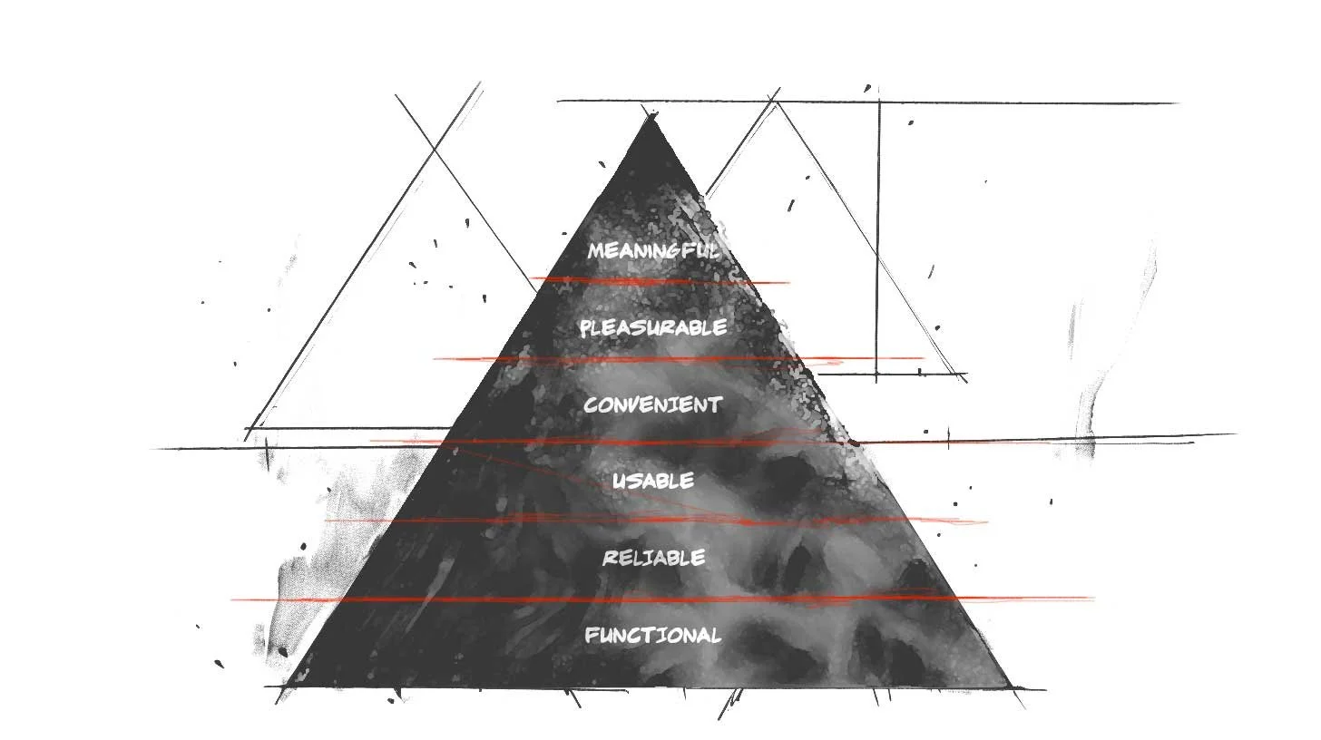
Stephen Anderson’s UX Hierarchy of Needs
Nothing is absolute
Pithy irony aside, we can’t reduce design to absolutes. There are no universal rules to achieve clarity, only principles to apply thoughtfully. We must be judicious and make choices that balance simplicity and depth, ease of use, and capability. The clearest designs meet people where they are and give them paths to where they want to go.
“Simplicity is relative. What is simple for [one] device may be dumb or intricate for another.”
—Raluca Budiu, Ph.d.
Clearly focused on our North star
Focusing on clarity over fashion or dogma we can create designs that serve human needs and potential. Our role is not to simplify but to reduce complexity in context through understanding and empathy. Clarity, not simplicity, should be our North Star. Only by embracing the complexity of design and human experience can we make something seem truly simple.
Delivering Quality Experiences
Effective UX has to walk the line between fresh and novel, and usable. Novel is interesting initially, but usable has to be useful when the shimmer has worn off. We strive to achieve both of those valuable experiences.

Photo by Michaela Baum on Unsplash
1. The Basic Design Process
The Brief
We've all seen the cliché memes even if we haven't experienced them ourselves:
Make the logo bigger! Make it pop! Add more sizzle! Make it fresh! Wow me!

And, honestly, we've also seen some sites that do just that, some even do it well. Everything from auto-playing music and sound effects, to parallax, animated gradients, interactive video, even websites that are almost full-blown video games in their own right.
It can feel as if every call with the client begins in a similar vein.
"We're building <APP> for <VERTICAL>. It's like <OTHER APP>, but ours will be different because <POP/SIZZLE/GAMIFICATION>."
We nod our heads. "It'll have dynamic, user-content-driven dashboards!" Yep. "And we want it to work on mobile and tablets." Absolutely. "It'd be cool if we could have some ML and AR involved there too, but we're not sure how yet. We're hoping you can help us figure that part out." Nothing new here. You want it to be accessible too right? “Oh yeah, accessibility! If we have time left, do that!” <sigh>
Research
You do your research. You talk to the stakeholders. You ask hundreds of questions of your client's customers. You unravel the knot of unknowns, and patterns of user behavior emerge. You begin to understand what the business actually needs, and what the users actually need. You rough out an IA and test it. You see the pitfalls in the current journey. You identify inefficiencies and problems, er, opportunities across the service layers. You present your findings. "Yes! You get it!" the client says. We're all on the same page. You understand the problem, and you begin solving it.

UX Design
You wireframe. You prototype. You assure the client that, no, these aren't the actual colors. No, that's not English it's called Greeked text. “Why does it look like Latin if it's called Greeked text? Why don't the numbers in those columns add up?” So you replace all the lorem ipsum with real-ish copy and adjust the numbers to make a little sense. Okay, now they get it. No, that's likely not the font you'll use, we're just trying to get a sense of how things work first. Visual design will come later. Okay, they get it. Sort of. So, you begin testing.

Photo by Amélie Mourichon on Unsplash
Testing
Testing goes great. You uncover some problems with the IA. No biggie, super-easy change. You see some small issues with some labels, so you wordsmith those. There are a couple of show-stoppers that make you feel stupid. How did you not see that before!? But you see it now, and you've already got 2 or 3 ideas for how to solve that. Things are smokin! You report your results. It tested through the roof, and you're very confident users will experience very little friction. They'll be able to easily grasp the tasks with no supervision. You've organized things with clear paths. Sequential work is laid out so it's obvious what came before, what they're doing now, and what comes next. The client begins to see how amazing this new vision is. So you move on to visuals.

Photo by UX Indonesia on Unsplash
Visual UI Design
The visual designers kill it. Maybe it's another team. Maybe it's you. Maybe it's Maybelline. They've transformed your usable, utilitarian, efficiency-driven low-fi wires into gorgeous, pixel-perfect renderings of the final vision.
And here's where things can get dicey.

Photo by Daniel Korpai on Unsplash
2. The Road To Destruction
Make it Pop!
"I like it..." says the HiPPO. "...but I don't love it." This is nothing new. We're designers, and this is the path we've chosen. Okay, that's fair. What don't you love about it?
"Oh, I don't know. It just doesn't pop/wow/sizzle/whatever. Have you been to <THAT HOT VIDEO GAMESITE>? They've got lasers, and real-time AR video that places you right in the middle of the screen and when you move your mouse around your little guy runs after it! And when you scroll, it scrolls horizontally, not vertically, which gives it a panoramic feeling! It's really cool!"
Everyone is forcing smiles and nodding...
"I know our accounting platform isn't a video game, but why can't we do something cool like make the avatars move around, or use their webcams to show a real-time view of their face so they don't have to upload a photo? What if when they scrolled, the data grid used that cool parallax motion so the columns moved underneath one another like those cool Miyazaki films? Anyway, all our competitors scroll vertically...what if we laid all our stuff out horizontally? It'd really set us apart!"
Okay - so I may be exaggerating some client requests and expectations, but honestly, not by very much.

The infamous LingsCars.com
Note: I don’t hate Lingscars.com for a number of reasons. Perhaps that’s another article.
Also, I’m not talking about getting the right feedback at the right time. That’s a different issue, nicely addressed in this article by James Cook.
3. The Path To Quality
The Truth
It’s times like these my boss Tim is wont to say
“Effective UX has to walk the line between fresh and novel, and usable. Novel is interesting initially, but usable has to be useful when the shimmer has worn off. We strive to achieve both of those valuable experiences.”
The first thing about introducing anything "fresh and novel" is that you've created your own usability debt. By its very nature, the user is being introduced to something they may not be familiar with and will have to discover and learn. If this is a game, or a marketing site, maybe that's a great thing. If it's accounting software, it's not. In fact, in most (if not all) cases I'd argue introducing your own obstacles to clarity and efficiency, not managing to your user base's existing mental models is bad. It’s like tying your own shoelaces together then trying to sprint.
Remember Stephen Anderson's hierarchy of UX?

Concept and design by Stephen P. Anderson
We assume the app will be built to function reliably. Our job is to make it first usable and convenient. Only when we've established that base platform can we even begin to explore pleasure and meaning. If you try to design for uniqueness and stand-out visuals prematurely, you'll compromise your own foundation that your research and design teams spent so much time and effort establishing.
Does this mean we don't try to cross the chasm of convenience and push our apps into the pleasure zone? No. In fact, apps like Word and Excel could really use a healthy dose of pleasure and meaning, and dare I say convenience as well. But managing design and experience at this level gets exponentially harder. Your baseline reliable functionality that's relatively usable is table-steaks. It absolutely has to do that or nobody will use it at all. But if you don't even try to shoot for some novelty, some fresh expression, they may use it a bit, but have no desire to come back. This is one of the biggest problems with MVPs (minimum VIABLE products). When was the last time you really enjoyed an experience or app or site and said to yourself, "Wow, that was a really viable experience!"?
The Product Roadmap
This is why we choose to design and build Minimum VALUABLE Products (I'd also have accepted Minimum Lovable Products). Because MVP is so common though, we don't even use that acronym. We use Cupcake, Birthday Cake, and Wedding Cake.

Cupcake (your minimum valuable product) is what absolutely must ship, otherwise, there's no point. It's important to note here that Cupcake isn't a horizontal cut of the hierarchy though, sacrificing convenience, pleasure, and meaning for a baseline product that merely satisfies at an intellectual level. No, Cupcake products cut vertically up the pyramid, capturing a bit from every layer.

The cake analogy is so powerful, because at their core, all three types of cake are the same. You've got flour, eggs, sugar, cocoa, icing, maybe even a creamy filling and a topper. A bite of a cupcake and a wedding cake are essentially the same experience, just in a less substantial form.
Cupcake offers a compelling experience
Birthday Cake enhances that experience
Wedding Cake is the full realization of the product vision
Cupcake encompasses the things you KNOW you must deliver to provide real value.
Once that core value is delivered, you can begin on some Birthday Cake revisions, adding additional features, functions, dare I say, even sizzle, insomuch as they enhance the core experience of your app. You scale. You are able to handle more clients. But when you're building Cupcake, as much as you want that slick new feature or novel AR avatar experience, you have to justify that it's part of the core foundational experience and nobody would bother with your app without it, or, if it's an enhancement that can build onto the base in a fast-follow release (Birthday Cake). Wedding cakes are the "big show" of cakes.
Wedding Cake is what you envision your product to be two to five years from now, with all the bells and whistles that make Wedding Cakes so much more substantial than your humble cupcake. But all the while, you're really providing the core value in your initial cupcake offering, and getting hung up on fresh trends and unique, fun, and sizzling design can detract, and more often, even degrade, even break your core experience.
Have Your Cake & Eat It Too
To wit:
The Basic Design Process
The Brief—Effective planning and setting expectations
Research—Discover insights into the problems you’re solving
UX Design—Design like you know you’re right
Testing—Test like you know you’re wrong
Visual UI Design—Enhance the experience with brand guides and style
The Road To Destruction
Make it Pop!—Here be monsters
The Path To Quality
The Truth—Keep it real, make sure you stay focused on what matters
The Product Roadmap—Cupcakes! Delicious, moist cupcakes!
Let's seek to build Cupcakes that span the layer-cake hierarchy from functional, to reliable, to usable, past the chasm of convenience, even to pleasure and meaning.
Once we've designed the thing the users actually need that supports the business' goals, don't let sparkle get in the way of delivering a great, valuable product.
The Service Design of Nest
There are many reasons to get a Nest thermostat. It’ll probably even pay for itself in a year or two, then start saving you money after that. Here’s the clincher though — the reason I evangelize the Nest wherever I go.


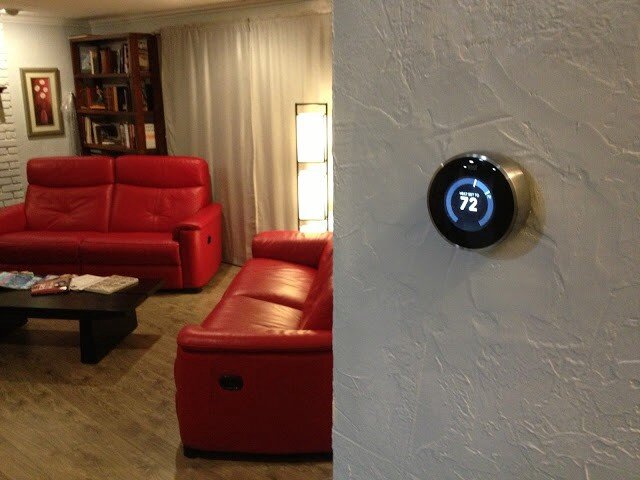
Yup. All kinds of old-school fugly.
Here is what I had immediately following the install of my Nest:


Here it is once I fixed the texture and painted:
Here were the features of my old thermostat:
Adjust-ish temperature of house from device
And that’s it.
Here are some of the features of the Nest thermostat:
Adjust temperature of house from device precisely
Adjust temperature of house from anywhere in the world
Program device to adjust temperature of house
Teach device to adjust temperature itself automatically
Detect when I’m home/away and adjust temperature accordingly
Just use the fans and turn off the heat/cool to conserve energy when possible
So those are just SOME of the features of the device itself. That feature-set is enough to convince many it’s a good buy. But there are a lot of thermostats out there that do that sort of thing (sort of). Why should you buy this one?
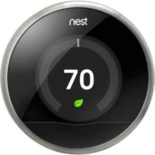
So, sure. It’s really cool looking. It’s got that nostalgic feel where you just rotate the outer ring to raise/lower the temperature. It’s got a nifty LCD screen with animated features that tell you all sorts of things. You can control it from your mobile device with a free app.
“Brandon!” you say. “What the heck is the point of this post already?”
OK — here it is.
These are all great reasons to buy and install the Nest thermostat. It’ll probably even pay for itself in a year or two, then start saving you money after that. Here’s the clincher though — the reason I evangelize the Nest wherever I go: It’s all of this, and more. The most important two words of this whole post: and more.
When you hear about the Nest for the first time it’s kind of silly — why is everyone getting psyched about a thermostat? Guess I’ll check it out. What’s the URL? nest.com — oh cool, that’s easy.
1 point Nest.
…and more…
Okay — I’m at nest.com, wow — gorgeous website; clean, simple, rich with details and animations.
10 more points Nest.
…and more…
Really helpful information, tutorials, testimonials etc.
5 more points Nest.
…and more…
But how do I know if it’ll work with my old and busted system? Oh — an online compatibility checker — sweet!
15 more points Nest.
…and more…
And that’s when I pre-ordered my Nest.
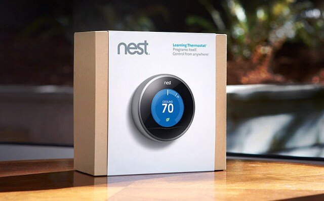
When you get the box in the mail — it’s beautifully packaged.
Here is a very detailed video I suggest watching that covers pretty much the whole 9 yards.
…and more…
As you unbox the Nest, even the attention paid to how and where the items are placed is impressive.
10 more points Nest.
…and more…
Just about every tool you might need is included.
5 more points Nest.
…and more…
The instruction manual is very clear, easy to understand and full of pictures.
5 more points Nest.
…and more…
The manual contains little stickers I can use to label my cables as I disassemble my old piece of junk so I can hook it up to the Nest correctly.
5 more points Nest.
Here is what mine looked like at this stage in the process:
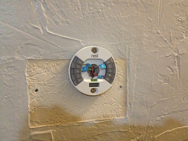
Note: It also comes with a cover plate that would’ve covered up that nasty wall without having to texture and paint, but I was going to do it anyway.
At this point, I’m just giddy with anticipation. All I have to do now is plug in the main device and we’re good to go. Oh, crap:
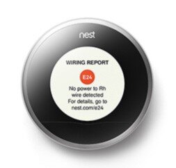
Crap crap crap. The first thing I see is an error. That’s not good.
-20 points Nest.
…and more…
What’s it say — There’s an error code — E24 and there’s a URL — nest.com/e24, so I go there. Oh, I probably just have a loose wire. I pull off the device, sure enough, exactly what they stated is what has happened. I reseat the wire and plug the device in — it works perfectly. The error was actually my fault, but the error reporting and ease of resolution have now made me a Nest fanboi. I’m actually GLAD I got the error so I could see how well they handled it.
+50 points Nest!
…and more…
It gets better. Now I install the iPhone app. I can’t even begin to tell you how cool it is. The stacked bar charts, the gamification of keeping my home green and warm all while saving money…it just goes on and on.
+100 points Nest.
…and more…
And now that everything’s installed, I hand the iPhone to my wife. She starts to play with it and falls in love with it after about 5 minutes. Her first experience with Nest was the iPhone app — and she’s just as big a fangirl now as I am. As I am a fanboi that is. Ahem…
+1000 points Nest.
Total: 1186 points Nest
Every day I discover new features on the hardware and the mobile app that continue to engage and satisfy.
This is Service Design
This is what service design looks like. It’s the magic recipe for success in your startup, design, party, endeavor — it doesn’t matter: always be ready with the ‘and more’ for your customer. When you can anticipate and pre-fulfill their needs at virtually every single step of the way like Nest has, you win. Each time a user interacts with your brand or product — that’s a touchpoint. Good service design ensures the user experiences ‘surprise and delight’ at each touchpoint, even if it’s an error or a support call.
At every step of the process from learning the nest.com URL until I handed the phone over to my wife, Nest surprised and delighted me. And more. Every single time I moved from one step to the next, I felt that Nest always had my back and had solved my problems before I even knew I had them. Imagine if every service, device, and software application we used went to such great pains — I think the world would be a much happier place, and more.
DISCLAIMER: I do not now, nor have I ever worked for Nest.