Only You Can Prevent Dumpster Fires
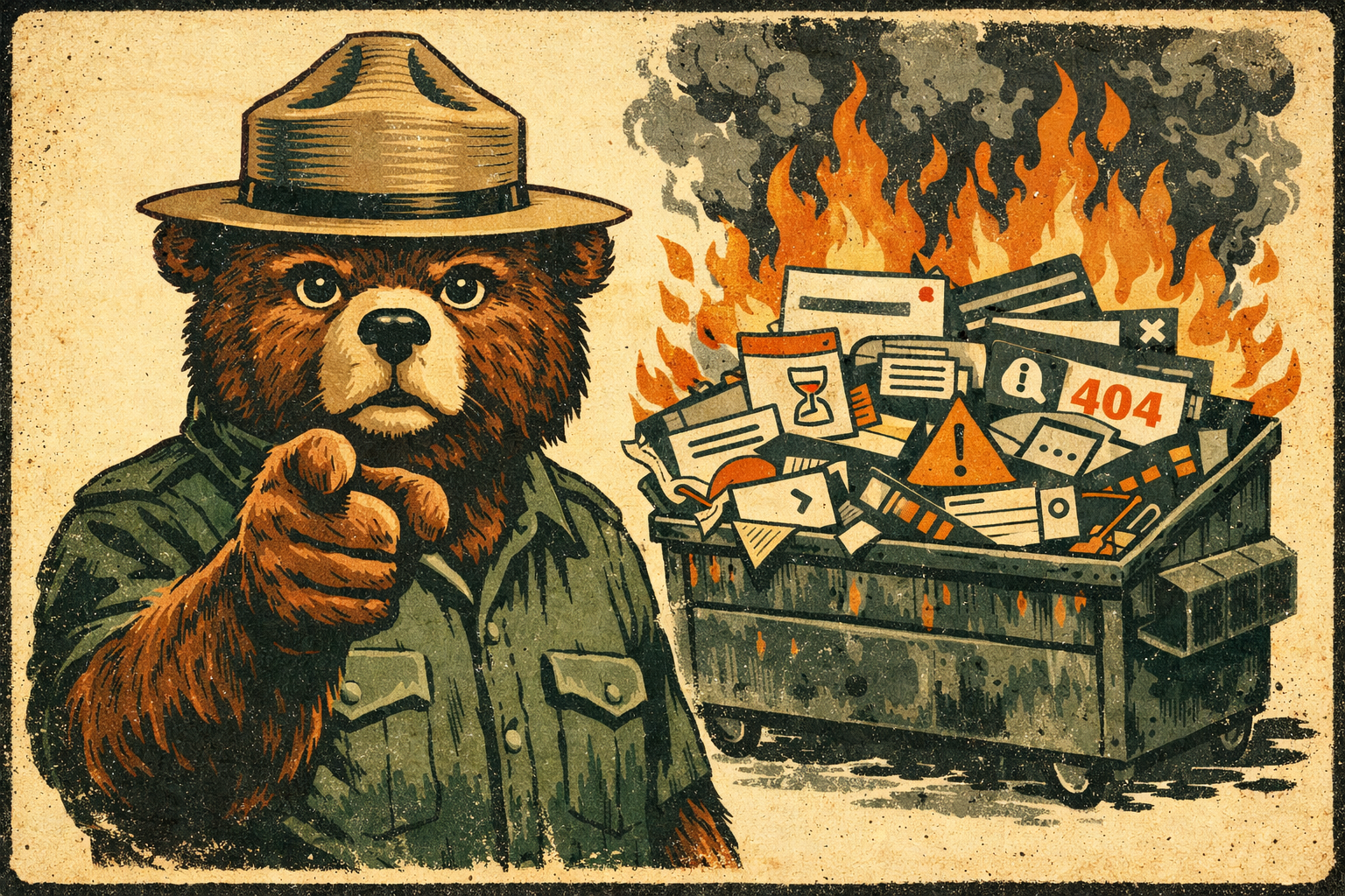
Smokey the B.A.
We all know there are piles of annoying things in the world. Many people I've encountered across my sojourn on this tiny blue dot have suggested (not without evidence) that I am one of them. Fair cop.
Even so, I'd argue it's our moral imperative, as people who build and design things, to not make them worse. To not add to the pile. Our job, if we actually care about doing it well, is to wring clarity, joy, and meaning out of chaos rather than stir it up.
So. How do we actually do this?
Design for the edges, not the average.
There is no such thing as an average user. The moment you design for some imaginary, able-bodied, native-speaking, high-bandwidth, well-lit, emotionally regulated person in the middle of the bell curve, you've already failed everyone else, which turns out to be most people, most of the time.
Accessible-first isn't a constraint. It's a forcing function for clarity. When something works for someone navigating with a keyboard, dealing with low vision, using a phone in bright sunlight with one hand, or reading in their second language, it works better for everyone. Full stop.
Accessibility isn't a feature you add at the end. It's a commitment you make at the beginning and hold throughout. If no one in your organization is owning it, congratulations: that's you now.
Have mercy on our weary eyes and brains.
The single most underrated act of design generosity is restraint. K.I.S.S. doesn’t have to be a lazy heuristic: it's a discipline. Every option you add is a decision you're forcing on someone who already has too many. Every label you leave out is a small act of cruelty. Every interface that requires a database engineer to interpret is a failure of imagination, not a failure of the user.
Build information architectures that meet people where they are, not where you are. You will always be the single least-representative person in the room for evaluating your own work. You know too much. You've been too close to it. You're likely to never be the target user for anything you will ever design, and the sooner you make peace with that, the better your work will get.
Healthcare software. TV remotes. Airline booking flows at 11 PM when you're exhausted. These things didn't get bad because no one cared. They got bad because someone stopped asking "what does this person, in this moment, actually need?"
Don't be the Earl Scheib of your industry.
Deceptive design is a choice. Dark patterns, anti-patterns, whatever you want to call them, it's a choice to treat your users as marks instead of people. And even when it's not intentional, when it's just sloppy defaults or inherited patterns nobody questioned, it's still your problem. Ignorance isn't an excuse; it's an invitation to do better.
Brand loyalty isn't built through clever manipulation. It's built through trust. It’s built through the accumulating experience of using something that behaves like it's on your side. Every confusing confirmation dialog, every pre-checked opt-in, every deliberately obscured unsubscribe link is a small withdrawal from that account. Eventually, the balance hits zero.
Protect people's privacy. Be honest about how their data is used. Own your mistakes publicly and with specificity, integrity, and humility. Then fix them.
Test your stuff. For real.
Something that seems perfect to you is probably a raging annoyance to everyone else. This isn't an insult, it's physics. You have context your users don't have. You have assumptions baked in so deep you've forgotten they're assumptions.
Do the research. Talk to actual humans. Watch them use the thing you made. Sit on your hands and don't explain it to them. The silence when they're confused? That's data. The sigh? Also data. The moment they give up? That's the most important data of all.
If you can't be bothered to empathize, test, or think critically about the people you're designing for, do everyone a favor and don't design anything. Perhaps consider a walkabout.
Give a damn.
Ultimately, reducing annoyance comes down to one thing: caring. Not performatively, not in a mission-statement way. Actually caring about the cumulative impact of your choices on a stranger's day.
If you wouldn't want to use the thing you're making, that shows. If you're more interested in what's flashy than what's useful, that shows too. The people on the other side of your interfaces aren't metrics. They're people with limited time, divided attention, and finite patience. They deserve better than thoughtlessness.
So do the right thing. Make the extra effort. Build something that feels like a small act of grace in someone's day.
You'll sleep better. And somewhere out there, a person you'll never meet will silently bless your kind, unannoying soul.